Monday, August 2, 2010

Final Project

I wanted to share my final projects with the rest of the class. I got permission to use a letter press machine, since type and typography were an important aspect of this project.

I brainstormed forever on what to do... Doing a self portrait of any type is difficult for me. This first project came to me over dinner last weekend and I went with it. The theme here is that it's a poster introducing the new IT guy to a company. This IT guy, tired of being pulled in a 100 different directions at once, took vengeance upon this poster. I hope you enjoy the photograph (I got the "costume" at a thrift store (those are actually 3-d glasses).

I learned a lot about letterpress on this project. I only had access to the press for one weekend, and it took me about 13 hours total for both pieces over two days (the actual photographs and written work only took about 3 hours).


For the 2nd poster, I wanted to do something similar - Letterpress, photograph, etc. But I wanted to use a more 'normal' photograph. I decided on this poster based on my experiences with IT contractors. Businesses typically contract IT staff based on their various certifications. My argument is that certifications are no replacement for true business experience and collegiate education. I'm not saying certifications are useless - but just that I put high stock into actual employee experience. It's frustrating when your organization contracts a temp or consultant, and then you need to spend 2 months 'training' them because they have no experience into what you or your organization actually does. Add to it, that consultants typically make double what a regular full time employee makes (though sometimes without benefits, health-care, etc...).
This poster is again a organizations bulletin announcing a new I.T. consultant, that was again vandalized, but this time by other staff.

These posters do represent me. Part of me is that frustrated nerdy guy in the first poster, and part me desires to be that overpaid IT guy in your company's future. Hopefully though I will be a humble, overpaid IT Super Guy.

Thursday, July 29, 2010

Entry 20: A Lion's Vendetta

Here were the instructions for Entry 20:

Cut the five images out and turn them face-down on a table. Mix them up thoroughly, arrange them in a line, and then turn them over. You should have five images randomly aligned in a row.

Your task is to write copy underneath each image to tell a story– sort of like a cartoon.
Look at the illustration in each frame, then as a whole, and create the story you will be telling.

Write a dialog, scene setup, or a simple explanation of what is occurring in each of the scenes. Write no more than 2 sentences for each image.

Having written in our discussion forums about some of my favorite one-a-day T-shirt Websites, I decided to pull five images from the t-shirt websites I frequently visit. I captured each image, and then assigned a number to them. I then used a six-sided die and kept rolling until all five numbers came up - and used that order. I did not look at the design's names until after generating the body for each image.


Sources:
Image 1 - (Name unknown) - preorder design from www.tshirthell.com (warning: many of this site's designs are no way near politically correct).
Image 2 - "Break Yo Mama's Back" from www.teefury.com
Image 3 - "Painted with Water" from shirt.woot.com
Image 4 - "The Twilight Rider" from www.tilteed.com
Image 5 - "Atomic Sketch 2 Year Anniversary" from riptapparel.com


Tuesday, July 27, 2010

Entry 19 - Mirror Mirror on the Wall... Who's the Sexist of them All?

Many of today’s and yesterday’s ads contain MYTHS. “In today’s society, the modern myths are built around things like the notions of masculinity and femininity, the signs of success and failure, what signifies good health and what does not.”

I wanted to focus on the notions of masculinity and femininity – and along that line – the sexism used in advertising. In the middle of the century, it was rampant. Here’s an ad that’s a perfect vintage example of this:


But today is 2010. We would never see such blatant sexism in ads. Take for example the refined car manufacturer, BMW (Bayerische Motoren Werke / Bavarian Motor Works). Such a reputable company would never stoop to such blatant sexism in ads today. No… Wait… They do:
("You know you're not the first")

Ads such as this create myths and stereotypes about their products. Indicating the myths that men are better drivers or that women are attracted to guys with ‘Beemers’ is pretty ridiculous, yet there are those out there that still run with such stereotypes. Attend any auto show and my point here is reinforced, as you will often see scantily clad women draped over vehicles. I consider myself a motoring enthusiast. I personally don’t appreciate it when I want to talk about a car’s performance and style with a dealer’s associate at an auto show, that I have to first bypass such stereotypes. I like cars, for the car. Never because I think a woman would like me or less for the vehicle I drive.

When I try to look at this from a female perspective, I can’t even begin to imagine how such ads can soil a company’s reputation with perspective female consumers. I think any woman would be insulted, if not outraged, by the ads above.

Monday, July 26, 2010

Entry 18 - Elephants, Cheetahs, and Angelfish - Oh my!

Frank Jefkin suggests three basic principles for effective advertisement writing:

1. The advertisement should be of interest and value to the reader.
2. The advertisement should be precise, that is, get to the point as quickly as possible
3. The advertisement should be concise, saying what it has to say in the fewest necessary words.

(click on me for larger image)

I actually chose a series of ads for this assignment – as they are all related, and all the same company.


AT&T wireless did an ad campaign where they used a series of people’s hands that were painted up to be landmarks, animals, or people that are indigenous to a particular overseas country where they offer services. Each simply states “Works in over 200 countries, like _____.” The ads (as shown in the bottom-two images) do showcase a website and “The best coverage of any carrier worldwide.” The cell phones, iconic images, and the advertising of multi-country cellular services is of definite interests to the reader of these ads. They are precise and get to the point very quickly. I think they also make minimal use of text. If you want to learn more – you either click on – or later input - their Internet address.

I think Mr. Jefkin would approve of this entire series of ads.

Entry 17 - Rocks ~&~ Cerries!!

Source: Motor Trend: July, 2010

I liked this ad for my journal entry 17 – in part because I think it’s a good example of color – but also for a color reference.

This ad uses colors that both compliment and contrast well. The background color is a light yellow or khaki color that contrasts excellently with the three dark images of the road, the truck, and the product itself, the red can of Mother’s car wax – creating a complimentary harmony.

This background also works well with one of the main focuses of the ad, that of the stripes in the road. These two yellows are analogous of each other or maybe even monochromatic (shades and tints of a single color). I think the colors work well to focus the eye on the center image. This image in turn, makes you want to read the body. I think this is actually a pretty crafty advertisement in how it lures you into reading. Sure – it’s just a rock – but it represents a possible dent/ding/scratch in my beloved car.

This ad’s body also states: “We can only hope that one day, some little girl finds you, paints you PURPLE, sticks little googly eyes on you and names you Sally.” This aligns well with our class’s learning in that the color “purple has a feminine and romantic quality” and “is said to enhance the imagination and thus is used in decorating children's rooms.”


Maxim Magazine - July, 2010

My second ad can be summed up easily: Red, red and more red.

Skyy is a brand of Vodka, and like most brands of vodka these days, they have many flavored infused varieties. This ad is obviously for cherry flavored vodka.

They use red for the lipstick, skin make-up, cherries, some type and the background image. The main colors in this ad, the reds (mentioned above), the blue bottle and the yellow/brown skin tones create a near-triadic color harmony.

Additionally, there is some white in the image. The Caucasian woman and the lettering on the bottle (white) – along with the strong red and blue elements almost make this ad patriotic for American readers, and it was fitting for the back cover of my July Maxim (i.e. July 4th).

The ad is already sexy with the use of the cherries and the made up women faces – but red, a color that represents sex, passion, love, energy, and heat – is an excellent choice for an ad for either a young men’s magazine. I could see this same ad being used in a similarly formatted women’s magazine such as Cosmopolitan. This add though, might fail in some parts of Africa though, as red is often representational of death or mourning.

Entry 16 - A logo from the dark side...

For entry 16 – I am going to journey to the dark side.

This is Apple’s first log in the mid 70’s…

This logo was designed by Ronald Wayne. It looks black and white at first glance – but you look closely into the sky, you will see color there. The border reads: “Newton… A Mind Forever Voyaging Through Strange Seas of Thought… Alone.” I feel this is a decent color choice for a logo, as it easily translates to a complete gray scale, ideal for monochrome copiers and printers of that time period. 4-color printing was around, but could get expensive. Some might argue that this log is too old fashioned and not well representing a computer company… well – that is what Steve Jobs thought, too…


In 1976, Steve Jobs (i.e. Voldermort, Lord Vader, Khan, Xerxes, Skeletor, etc…), commissioned designer Rob Janoff to come up with something more modern. The bite in the apple was implemented to keep it from looking like a tomato, according to Janoff. I think the rainbow color looked and contrasted great on the Apple of Old – especially the beige Apple II series and early Macintosh. Being the rainbow, you might say this is double split complementary, as nearly each of the Roy G Biv colors are illustrated, although not in the traditional order. I think Janoff wanted green at the top, as that is where the leaf is.


This is their latest logo – which again The Joker… er… Rasputin… I mean Feddie Krueger – oops – I meant Doctor Doom… … oh… alright – STEVE JOBS - had another hand in. Jobs returned to apple in 1997. Apple went to the current monochromatic metallic apple-logo. A key reason I think they did this is they wanted something that looked better on the big colorful plastic iMac’s of the late 90’s.


A little research and I also found opinions stating they went monochromatic as to save money on printing. The rainbow Apple required 4-color printed decals versus a solid black or gray for the new decal.

Well, personally, I like the newest Apple logo. And the general look of the brushed aluminum Macbooks and iMacs of today. I think putting a rainbow decal/logo on such devices really detracts from the clean lines and design of Apple's modern products.

Thursday, July 22, 2010

Entry 15 - Historic Raging Hippies

I was asked to think of words/images that came immediately to mind when given the following words.

RAGE – Primal Rage
ORDER – Court room drama
JUSTICE – Lady Justice
EVIL – Skeletor
PEACE - Hippies
GOD - Thor
HISTORY – WWII/101st Airborne
PAIN - Knees
SMART – Smart car


Next, I was asked to provide a pair of images for each. My first image is one
that I believe is a denotation of the image, the second image would be my connotation of the image.


RAGE – when most of us think of “rage” – likely we might think or road rage or perhaps yelling at telemarketers like the denotation image of this raging woman?


Though my first connotation was of an old video game that feature fighting dinosaurs and other prehistoric beasts called “Primal Rage.” Although if you want to see some hard core raging by a little German kid – check out this youtube classic: http://www.youtube.com/watch?v=PbcctWbC8Q0


ORDER – I think a picture to represent order is an image from the TV show Law and Order:


Do you want the truth of what connotes ORDER to me? YOU CAN’T HANDLE THE TRUTH!! (Sorry – couldn’t help it). Yes… it’s courtroom marine/naval drama, “A Few Good Men.”


JUSTICE is usually depicted by police or other anti-criminal action – or perhaps, like Order, in another courtroom drama.


When I think of justice – I always imagine lady justice, complete with blindfold, scales and sword.


EVIL – like the other words so far, Evil is an ideal – and not something easily to picture as a denotation. Though I think we can readily agree that satanic images such as this devil picture often denote evil:


The image my mind immediately came up with was Skeletor from the comic and cartoon franchise, He-Man and the Masters of the Universe. The original cartoon was a little cheesy, but I always felt that Skelotor, with his grim reaperesque appearance made for a great evil villain.


PEACE – there are some uniform symbols for peace – such as doves and the V symbol made with a hand – and of course – what most of us just refer to as the peace symbol:

My first connotation of peace is hippies. And when I thought of hippies, I thought about how Eric Cartman from South Park hates hippies…


GOD - I feel the general denotation for God (in American culture) is an old, bearded, wizened-looking fellow. Such as from Michelangelo’s “Creation of Adam:”

Personally, I have often wondered what daily life would be like if we still worshiped a pantheon of gods, such as the Greeks, Romans and the Celts. I’ve always been enamored with the Norse gods, and immediately thought of Thor, Norse god of thunder and lightning, when given the word, “god.” (Bit of news: they are making a big budget Thor movie (based on the Marvel Comics character) due out next year).


HISTORY is such a symbolist word, it’s hard to conjure just one image that be a denotation of it. I think collages of historical figures or timelines might best represent the word. Here’s a collage that indicates US history:

I think due to my personal history, I immediately thought of the 101st Airborne in WWII (ala Band of Brothers). I served nearly 3 years with the 101st Airborne and they were some great years indeed. Band of Brothers remains my favorite of any wartime TV or movie drama. Another connection I have is that Richard Winters, one of the real-life people that were reenacted, lives in Hershey, PA – which is where I was born and spent most of my childhood and adolescence.


PAIN is another tough word to denote. I think this image representing back pain does a good job though:

I have some ongoing pains in my knees which started (and was misdiagnosed) with childhood arthritis. It gets a little worse every year. Last consult I had, the docs wanted to cut me open… so I until it really changes my standard of living, I will just keep with stretching and anti-inflammatory meds...


SMART or brainpower or IQ and the like are typically portrayed by brainy looking images such as this:

When I think of SMART – I think of the Smart, a small car made by Mercedes Benz. I like the car’s size, but wish they did better on gas (they get about 30mpg, where as one of my two Mini’s gets nearly 40mpg). One thing I don’t like, is that now that Smarts are sold in the USA, my Minis are not the smallest, most endearing things on the road. (Well, Mini's are still more endearing (and faster!)).

Wednesday, July 21, 2010

Entry 12-14 - iPads, Fast Cars, and Tequila (oh my!)

I wanted to start this assignment by defining some terms I might use in my discussion about some magazine ads. I will use these terms and others learned in my VC 101 course to answer some guided questions regarding each of three ads.

Denotation - What is pictured, first order of signification referring the physical reality of the object that is being signified.

Connotation - How it is pictured, second level of signification where the reader of the sign plays a part in the process.

Myth - Myths are a type of speech, a system of communications that is a message that allows one to perceive that myth cannot possibly be an object, concept or an idea. It is another mode of signification. In our lecture, Professor Melhus provides the example of, "Advertisements make us believe that a picture of a full, dark bottle of wine is a robust and healthy habit when really, wine can be unhealthy and inebriating."

Metaphor - Per our lecture by Professor Melhus: "Where we substitute one word or image in a sequence for another we can transfer the characteristics of one object to another."

Metonym - "A metonym works in a similar way except that it is used to represent a totality. Where we want to signify reality in some way then we are forced to choose one piece of reality to represent it. For example, if we want to represent all children we might use an image of a child. In this case the image of one child is being used as a metonym to represent the whole-- all children" (Melhus, 2010, "How meaning is formed").

Signifier - a component of a word, the word itself is the signifier. When signifier and signified come together, we get a sign.

Signified - a component of a word, the object the word represents is the signified. When signifier and signified come together, we get a sign.

Icon - 1 of 3 of defined categories of symbols, an icon is an image that actually represents well what it means. For example, a pedestrian walk sign - the pedestrian in the image looks like a person.

Index - 1 of 3 of defined categories of symbols, an index creates a direct link between the sign and the object.

Symbol - 1 of 3 of defined categories of symbols, symbols are signs that have no logical connection between the sign and what it means - like the American flag.


Entry 12 - Apple iPad (Source - National Geographic, May 2010)
1. What cultural myths are invoked in the ad? That an iPad is a simple and nice computer device that anybody can use. The ad also features a well-groomed woman’s hands. I don’t want to stereotype, but there is a typical male-geek image when people think of computer users. I think using a woman for this ad furthers the myth that anybody could use an iPad. Lastly, they user seems to be on a couch or chair with slippers on, and with their feet up. Not a usual position for using a computer.

2. What relationship do you see between those myths and the target audience for the product? How is the myth conveyed or hinted at? First, connotation for this ad is important. This is not a PC or gaming magazine, it was in National Geographic, which tends to cater to a more educated audience. I think that is their target audience. I don’t feel the ad would be appropriate to some of the PC/Gaming magazines I subscribe to, as most ‘techies’ know the true abilities of the iPad and how underpowered it is compared to competitive devices at lower costs.

3. How do the characters in the ad function as signs? I can put my feet up and read a book, surf the web, and play a few games using my iPad. As I mentioned above, the character in this ad connotes an image (or myth actually) that anybody could use an iPad, that it’s relaxing and maybe even a sophisticated thing to do.

4. What story does this ad tell about how happiness is achieved? Buy an iPad, read a digital book, relax, and you will be a happy.

5. How is this ad playing off its audience's desires and/or fears? This ad is playing playing to the desires of the audience. Typical home PC users have a bulky laptop or a desktop PC or Mac computer. I think if there is a metaphor in this as, it’s that an iPad frees a person from their stuffy office space and lets them curl up with a 1000 books on their comfy recliner.


Entry 13 - Lexus IS F (Source - Motor Trend, July, 2010 (centerfold of a 4-page ad))

1. What cultural myths are invoked in the ad? Vrrroooomm!! Red leather and carbon fiber on the steering wheel and paddle shifters – nice! This car – whatever Lexus it is – is FAST! Overall, this image is very cockpit-like, and like jets, giving a denotation of speed. Red is iconic with fast cars as well.

2. What relationship do you see between those myths and the target audience for the product? How is the myth conveyed or hinted at? This is appeared in a Motor Trend magazine, so the audience was me – that is – a driving enthusiast. Red has long been a color associated with excitement, passion and speed. The metaphor in the steering wheel with lit up displays (symbolizing a fast car) is explained to those that don’t readily get it: “Adrenaline in your hands.”

3. How do the characters in the ad function as signs? As there were no people in this ad, this question is not relevant.

4. What story does this ad tell about how happiness is achieved? Buy an expensive and fast Lexus – and you will be the newest-speedy-yuppie-trendsetter in your neighborhood.

5. How is this ad playing off its audience's desires and/or fears? The red in this ad, to me, is just delicious. I can almost feel that supple leather grip, and can I just imagine that speed go up from 0 to 65 in just a couple heart beats.


Entry 14 - Patron Tequila (Source - Maxim, August 2010)

1. What cultural myths are invoked in the ad? When friends show up unexpected, it’s best to get drunk so you can better withstand their company? Friends are more fun when you are buzzed? Most likely it’s just: your friends are worth $50 tequila.

2. What relationship do you see between those myths and the target audience for the product? This ad comes out of Maxim magazine which, I feel, advertises to men aged 18 to 40. In particular, this ad is geared towards an over 21 crowd, but some with either an appreciation for fine spirits, or ones with a higher income. The myth is easily dispelled when one considers the dangers of alcohol to the body or one’s impairment to operate machinery like their car, or worst, their cell phone.

3. How do the characters in the ad function as signs? As there were no people in this ad, this question is not totally relevant – THOUGH – there is a suggestion of people. They use words such as “simply perfect” and “friends.” This, to me, is iconic of some my simple friends… and some of my perfect friends. Or perhaps it means you can take your perfect friends, feed them refined tequila, and they become simple.

4. What story does this ad tell about how happiness is achieved? A certain Jimmy Buffet song about “adult situations” and alcohol comes to mind.

5. How is this ad playing off its audience's desires and/or fears? Everybody likes being a good friend. At a recent party I attended, a friend did offer Patron, and I must say, I was touched that he shared with us the “good stuff.” There is little that plays off of one’s fears – unless you fear not being a good friend.

Extra: I chose this ad as it was quite simple, just a product picture and a few choice words. I like tequila, but I don’t want to give an image to my classmates that I’m some lush or anything. Follow the advice of ads: Drink Responsibility.

Monday, July 19, 2010

Entry 11 - Decisions... Decisions... Decisions...

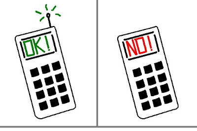
The following are conceptual signs that I might see throughout the day if more of my decisions came down to following signs such as walk/don't walk like you might find on a busy street corner.


Image 1)
This would be the first sign I see each day. When that I alarm goes off - do I listen to the radio and drag my butt out of bed? Or do I turn it off and go back to sleep? Well, I usually don't mind going to work - so it's usually up and into the shower I go.


Image 2)
This might be the second major decision I make each day - do I use my bike to commute - or do I take the Mini. As it's typically about 95 degrees when I am leaving for work - I tend to take the car most of these hot summer days. Once summer eases up, the bike will be the primary mode of transportation to and from the office.


Image 3)
This is an image I think should be on car dashboards. When ever the car is in gear, than the "NO!" image should appear. But if the driver has the car in park, or neutral with the e-break on, then they driver would get the "OK!" symbol. Personally, I think texting and driving is very irresponsible.


Image 4)
I'm on a diet right now - so food is often on my mind. I keep a cabinet at work stocked with cereal, but often times coworkers will bring in donuts to share. It's a tough call when I get into the office between that yummy donut or my Special K with strawberries.


Image 5)
Another food choice - I am surrounded by fastfood restaurants. Within a 1/4 mile I have a Burger King, McDonalds, a Jack in the Box, a Wendy's, a Panda Express, a Chick-fil-A, a subway, a Boston Market and a Taco Bell. Then there are all the mom & pop restuarants within walking distance. It's tough to stick to a packed lunch when you have all these yummy (though unhealthy) fast food places so close to you at the workplace.


Image 6)
My final image. This was the hardest for me to conceptualize in a simplistic manner. I wanted to show the choice some of us have at work to 'Surf the Web' or to remain busy and productive. I think I did a good job. (The lower PC screen pays homage to a particular favorite movie of mine).

Wednesday, July 14, 2010

Entry 10: Metaphor


To represent a good use metaphor in an ad image, I chose this French ad. Roughly translated from my two years of high school French: "Without a condom, with AIDS do you make love. Protect yourself.

Tuesday, July 13, 2010

Entry 9 - Inventions

The goal of this assignment was to showcase twenty inventions - the first 10 were to be inventions you believed to be important inventions; the second 10 were to be inventions which I really appreciate having in my life.

Image 1 - Clockwise from top left:
1) Lights - if we were stuck in a world whose only light came from the sun, I think things would be pretty dull. These lights are compact fluorescent lights. Fluorescent lights were invented by Arthur Compton in 1934.

2) Electricity - This is not exactly an invention, but many inventors were involved in harnessing it. Ben Franklin did many experiments and of course we have erratic Nikola Tesla.

3) Glass - could you even begin to imagine a world without windows? Without mirrors? (Without fiber optics?). Credit goes to the Egyptians or Phoenicians way back around 2500 BC.

4) Photographs - I love my camera - and enjoy collecting images of my family from the past. Invented by Louis-Jacques-Mandé Daguerre in 1837.

5) Books - actually - books, paper, and printing. Three amazing inventions. I could not imagine learning in a world without books. And my love for fiction is likely apparent in this picture. It was around 1450 when Johannes Gutenberg demonstrated his printing press with movable type.


Image 2 - Clockwise from top-left
6) Clocks - Christiaan Huygens gave us the pendulum clock in 1656 - the clock in my photo though is of a Quartz clock, invented by Warren A. Marrison in 1927.

7) Metal (Steel) - My grandfather brought these swords home from Italy after WWII. I thought they would represent metal/steel/iron very well. Henry Bessemer of the United Kingdom, in 1856, invented the techniques for mass steel production. My step-father is a retired steel worker.

8) Medicine - I've been enjoying The Tutors, a Showtime Channel drama based around King Henry the VIIIth. That show really makes me appreciate modern medicine and medical techniques. Sir Frederick Grant Banting and Charles H. Best, of Canada, invented the extraction and preparation of insulin in 1921.

9) Maps/Cartography - We'd be lost without maps. In 2004, Jeffrey Lieber, J. J. Abrams and Damon Lindelof created and launched the TV Series, "Lost."

10) Refrigeration - I love ice cream. Period. American John Gorrie created the 'fridge in 1842.


Image 3) Clockwise from top-left:
1) Air Conditioning - This photo represents my air conditioning. Tomorrow it will be 105 degrees in Tucson. The next day? 108. 'Nuff said. Willis Haviland Carrier created AC in 1902. Bless you, Willis. Bless you.

2) Modern Oral Care - Remember my comment above about The Tudors. Those folk had some nasty teeth. Thank goodness for fluoride! The Chinese created toothbrush's in the 1400's.

3) Indoor Plumbing - because outhouses stink. I'm also thankful for Joseph Gayetty - who in 1857 invented toilet tissue.

4) My daily meds - Nexium was about the 10th in a long chain of medicines my docs had me on for acid reflux problems. It's the the one that worked. The Aller-Tec is a Costco-brand Zyrtec - which makes living my two cats possible.

5) Safety Razor - I don't think I'd trust myself with a straight razor. I cut myself enough as it is. American King Camp Gillette created the safety razor right at the turn of the 20th century.

6) Clothing - because fur is just not cool. Eli Whitney gave us the Cotton Gin in 1793.


Image 4)
7) Evil Dave!!! - this one of my self-built PCs. Isn't she a beaut. I can't be a techie-boy without techie-toys. Contrary to what he might have said - Al Gore did not create the Internet (though Man-Bear-Pig may actually exist). Advanced Research Projects Agency (ARPA) at the Dept. of Defense created the Interwebs in 1969.

8) My rides - Trek road bike and Mini Cooper S. Minis were first made by British Motor Company in 1959. 1999, the Mini cooper was ranked a close 2nd as Car of the Century, behind the Model T Ford.

9) Tivo - Tivo has totally transformed my TV-viewing experience. Being a half to 3/4-time student and a full-time worker, it allows me to watch over the air programming when I choose to, not when the networks choose. I also can skip commercials - and add to it that I can stream 1000's of movies via Netflix through my Tivo to my TV. Tivo is awesome. Well - I guess I still need a TV - it is given mixed credit for its invention: Russia's Vladimir Kosma Zworykin in 1923, and American Philo Taylor Farnsworth in 1927.

10) Mobile Phone/Smart Phone - another life transforming device. I can read my email, send short messages, surf the web, take photographs... oh. And call people. From nearly anywhere. Bell Labs invented mobile phones in 1946.


Sources:
"Greatest Inventions of All Time" retrieved from http://www.i-dineout.com/pages2003/inventions1.html
Wikipedia.

Monday, July 12, 2010

Entry 8 - Word/Image Association

In this entry, I will be discussing my the images I chose to associate with particular emotional words.

Anger - Clockwise from the bottom right:
1) I started with several images of Marvel Comics' Incredible Hulk. I chose this one as it's iconic of "Hulk get Mad - Hulk get Angry - Hulk Smash" which is near about his registered trademark.
2) Angry Robot - this the actual icon for the publisher, Angry Robot. Most of their publications are horror, sci-fi, urban fantasy and traditional fantasy fiction. I just really like their icon - and am a fan of their printed genres. Liking sci-fi, I was tempted to use an Anakin/Darth Vader image (Fear leads to anger, anger leads to hate, hate leads to blah blah cookies blah blah...)
3) Mr. Grumble. This is one of the many Mr Men, which is a series of children books. I recall an old teacher of mine in Sunnymead (or Armada?) Elementary School (California) would read these to us at recess if you did not want to go out for recess. There's also a Mr Moody - he'd also be fitting for this collage.
4) Metallica's St. Anger album cover. I'm not a really big Metallica fan, but I do like some of their stuff from the late 80's and early 90's. Their symphony album was also pretty neat. This album is from 2003. The album art I think fairly represents its name, St. Anger.
5) Angry Wolf image. I found this image googling the interwebs. It's fairly iconic of anger in nature. Wild dogs and other animals often show their teeth as a sign of aggression.


Sad - clockwise from bottom right:
1) This is an Army solider playing taps in a military cemetery. I've twice served on funeral detail while serving in the Army. Taps would always choke me up, even though I did not know the soldier/airman/sailor/corpsman that passed away. Its a proud sadness of honoring one whose served their country, but a sadness nonetheless.
2) Daisy. I liked this one as it was a lone daisy which almost seems to have tears coming from it.
3) Orangutan - 'Tangs' have a natural down-turned/saggy face which gives them a sad-looking appearance. I think a lot of animals, especially mammals, often look sad. I believe it's their big eyes, especially when they look up at you with a lowered head.
4) Mufasa - This is image to which I am sure conjures sad emotions in most people, that of the proud king and father, Mufasa, the male patriarch in Disney's The Lion King. This is an artist's rendition of Mufasa after he was murdered by his brother, Scar.
5) Golden Era Comic - a traditional (1950's?) take on a female comic character.


Joyous - Clockwise from bottom right
1) I love Bill Waterson's Calvin and Hobbes. I think we can all relate to Calvin on some level. This image is just the two them caught in a fit of laughter.
2) LOLCats. Laugh-out-loud Cats is an internet sensation, and this is the primary image that started this online trend. LOL has become iconic to today's technology and its used to express happiness, joy and laughter.
3) Manhiem Streamroller's Christmas album art - Christmas, to me, is synonymous with joy. I chose this image as it also has the innocent and happy child.
4) Joyous Respite - This is a painting by the artist Rebecca Guay. She's done a lot of fantasy style artwork for different games and magazines. The title of this picture of Joyous Respite, and is well-named for the image of harmonious natural environment.
5) Snoopy! - I was doing a search for "dance" think I might find some happy dancer image, and came across dancing snoopy. I thought this a good image as it shows a very happy snoopy - and often times people are very happy dancing.


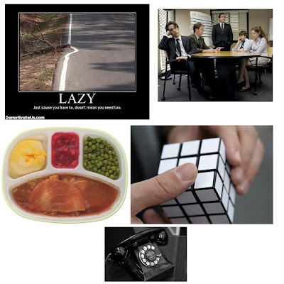
Uninspired - Clockwise from bottom:
1) First we have an old telephone. Notice all the fancy features of this phone. We have a rotary dial... and... um... that sleek corded handset. I picked this one as it was a reflection of the work I do every day, a lot of which involves configuring phones with over 100 features. Even when touch-tone phnes were later sold and leased by AT&T, they were still absent of any extra features we find on our phones and cellular phones today.
2) TV Dinner. Food does not get more uninspired than this.
3) Despair poster - Lazy. Laziness is synonymous with uninspired. This is one of many of Despair.com's demotivational series of posters.
4) The Office - Even though I've worked for many "Office-like" environments over the years, I only just started watching this show via Netflix about 4 months ago. I love it. It cracks me up. The workers at Dunder Mifflin paper company are often left uninspired by their manager, Michael Scott.
5) Rubik's Cube - I thought this an ideal gift for the uninspired, unmotivated friend.


Scared - Clockwise from bottom right:
1) "Scardy-Cat" - Halloween or anytime icon of a scared cat.
2) Mini Cooper - I love my Mini Coopers. This image, to me, is terrifying.
3) Scared Eggs - I could not help but to include this one, as it cracked me up.
4) Blair Witch Project - Many of us enjoy horror movies. And this was the first item I searched the web for when given the word, "scared."
5) 40. For some of us it's 30... others it's 50, 60, 70... ... it seems like with each decade we live, we fear the following decade even more.